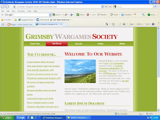
As I would like the new look and layout, plus the way it will be run to be a surprise and it seems that some people are interested in what is going to happen to it, I have decided to give you some information.
 This image (left) is not how it will exactly look but its a very close approximation. Of course, there will be loads more stuff on the finished product. I intend the style, down to the colours of the menu at the top and right plus the style of the main articles on the front page to be as you see here. The menu on the left, minus the clubhouse header, will be on the right while the front page itself will be on the left. Hopefully I would be able to reproduce the "Grimsby Wargames Society" header in 3 colours as you see on this image. The plan is to keep all the colours and styles you see here the same on Grimsby Wargames Society Website v3.0. This idea for the design and look was decided by me last year in fact and even told our esteemed club president about it at the time but just never got round to it.
 Now here's for some more useful info:
All Grimsby Wargames Society members plus members of the groups who use its facilities - as they are best placed to talk about them, using them all the time - to contribute is 2 logons. 1 Logon will be required to upload photos to a special photo group that has just been set up by me and another one to logon to the site itself and publish articles themselves, without any help from me unless they get stuck, including being able to publish photos directly onto the frontpage if they wish though I would have to limit the amount people put on to save webspace. The vast majority of photos will be hosted offsite.
However, my plans have recently been modified and the new version will be far superior to what you see here. It will be superior to all past reincarnations of the site. Started adding content to v3.0 yesterday with a page on club membership fees. At this moment in time the main menu structure plus sub-pages has been created with 15 static pages made with a possible 7 more static pages to be added for links pages plus something else fun I got in mind. The main menu consists of 8 main pages. It should be easy to navigate and will also be easier for me to maintain and add items if needs be.
More importantly, for me anyway, v3.0 will NOT be hosted on my other computer anymore. The domain http://www.gywargames.co.uk/ will continue to be used with it. There are no hosting costs involved either. There are a few other small costs involved but think that even I can take care of those even in my present financial situation. Those costs will only help me enhance the site anyway.
A screenshot of the near completed site will be published here closer to the time the domain switches over to it. Below is a shot of the same design with a mouseover effect on the main menu:

No comments:
Post a Comment